
There's something about the fusion of modern and retro that has my inner designer feeling warm and fuzzy. Nostalgic is probably the right word.
My design choices likely gave that away, but pixel art brings it out in full force. In that spirit, this article tackles two methods to bring those animations to life!
Now, everything in frontend web development starts with a box before cascading into bundles of neatly packed divs. Like div Tetris. Maintain that mental model as we dive into animating our whimsical, 8-bit sprites, as they work the exact same way.
What's a Sprite?
I used to love making "flip animations." I'd take a stack of Post-its, draw a stick figure on each, and make slight variations as I continued through the pile. Only when I rapidly flipped through them could I see the little animation I made.
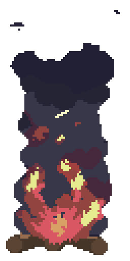
Those were, more or less, poorly drawn sprite sheets. A sprite sheet is a long strip containing each image in an animation. They look like this:

I source my sprites via two avenues.
If I can make it myself, I use Aseprite. Aesprite is like a simplified Photoshop specifically built to create 8-bit art. It's a fantastic tool and only requires a one-time purchase. That means no subscription model, which was my deciding factor.
I'm new to pixel art, so anything more than "basic" is out of my wheelhouse. When I hit that inevitable wall, I turn to pre-made sheets, our second avenue.
As sprites are typically used in game development, myriad sites exist to buy, sell, or open-source pixelized creations. Here are a few I've used myself, though a quick Google search showed dozens of options:
- Open Game Art is the largest and most active option. Free downloads range from full game assets to individual character models and actions.
- Kenney.nl is smaller but requires far less sifting to find quality art than OGA.
Animating A Sprite Sheet
How do we "flip" between images in a sheet? We'll need a few background tricks, but first, let's get a feel for how it all works. Naturally, the aspect ratio is set in pixels, with 64x64 as the most common.
For a typical 64-bit sprite sheet, our box moves 64 pixels along the x-axis to reach the next image in the frame. This repeats until we hit the final frame, after which we reset the x-axis and begin from the top. Note that the above requires 112px per image due to upscaling.
So, just like those flip animations, pixel art "moves" as we rapidly flip between images to create an animation. We have options here, but let's start with pure CSS.
The simplest approach is background. Background is a short-hand property allowing us to set myriad background styles within a single property.
For sprite animation, we're concerned with background-image, background-position-x, and background-position-y. These properties set our image URL and specify our alignment along the x and y-axes.
We previously touched on keyframes, but as a brief recap:
keyframesprovide waypoints for our CSS to follow throughout the life-cycle of an animation sequence. This grants granular control over each step of the animation sequence.
import "./styles.css";

export default function App() {
  return (
    <div className="App">
      <img />
    </div>
  );
}
We have life! But let's break that down.
First, we set an empty image tag in our App.tsx. While we're using a React sandbox, the same could done using only HTML and CSS.
We then set our image's background property to the image's URL, and start at the beginning of the image, as both the x and y-axis are set to 0px.
In animation, we set a variable name for our animation (playFire), which we'll target in our keyframes. It takes a half second to complete (0.5s), changes six times (steps(6)), and loops infinitely.
Moving down to our @keyframes, we target our variable, playFire, and set our start and stop values. Last time, we passed 0% and 100%. When only two values are specified, to and from function the exact same way. As singular starts and stops.
Now, each frame in the animation is 128 pixels tall and 64 pixels wide. So, to shimmy through it, we'll need to move 64px along the x-axis.
We start at 0 0, or the edge of our sheet, and with each step, we move 64px along the x-axis. With six steps and 64 pixels per step, we'll shift a total of 384px.
But why negative? Setting positive movement along the x-axis scrolls through the length of the image. But the effect we're after is static movement, so we invert that by pulling the image towards us. This keeps the sprites in sync and maintains our horizontal positioning.
The end result? Our playFire animation takes a half second to complete, loops infinitely, and moves -64px across six images, leaving us with -384px of horizontal movement.
Animating An Image Set with React
Sprite sheets are our simplest method, as we have everything along the same strip. But what if we have a folder with an image file for each animation step?
We'll need some React state for this approach, but the good news is the CSS is far simpler. It also lends a bit more control over the end result.
This is the method I chose for the fire on my front page. We'll cover the pros and cons of each, but I don't see a massive difference with pixel art animations. The file sizes are inconsequential, and the medium doesn't mind slight imperfections. We'll leave that to the realists.
1 import styles from './Campfire.module.css';23 // we'll assume these are held in public/assets4 const frames = [5 '/assets/fire/fire001.png',6 '/assets/fire/fire002.png',7 '/assets/fire/fire003.png',8 '/assets/fire/fire004.png',9 '/assets/fire/fire005.png',10 '/assets/fire/fire006.png',11 '/assets/fire/fire007.png',12 ];1314 export default function CampfireAnimation() {15 const [currentFrame, setCurrentFrame] = useState(0);1617 useEffect(() => {18 const timer = setInterval(() => {19 setCurrentFrame((prevFrame) => (prevFrame + 1) % frames.length);20 }, 125);2122 return () => clearInterval(timer);23 }, []);2425 return (26 <div>27 {frames.map((frame, index) => (28 <img29 className={`${styles["campfire-frame"]} ${30 currentFrame === index ? styles.active : ""31 }`}32 src={frame}33 alt="campfire frame"34 key={index}35 />36 ))}37 </div>38 );39 }40
The result is the same but a little more intuitive to implement. We still use CSS animations but leverage adaptive classes to simplify the process.
- Store the file paths in an array.
- Set our initial
stateto 0.
useEffectto set an interval denoting how long the animation runs. In the above, we cycle to the next frame every 125 milliseconds. Be sure to clear this figure in yourcleanup function.
- We then map through these frames, granting us the illusion of movement.
The CSS really only has two moving parts. We want to begin with each frame as display: none. This ensures we don't render the images out of order. It also allows us to set display: block on the active frame, displaying only the "active" image.
1 .campfire-frame {2 display: none;3 width: 300px;4 height: 400px;5 }67 /* Active frame */8 .campfire-frame.active {9 display: block;10 }11


Performance
I was asked which method is more performant (read: sleek, agile, insert your preferred performance buzzword), and I didn't have an answer. After testing, both come with pros and cons.
CSS is the move for pure performance. Relative to the React approach, initial load times take a hit, but once rendered the browser takes the wheel. So, our animation never re-renders, and the result is typically smoother and less CPU-intensive.
The CSS approach really only comes with one trade-off. It's far less flexible.
With React, we can change speeds, direction, or any other aspect of the animation dynamically. In other words, React lets you color outside the box. You aren't married to the initial movement as it can be tweaked to your liking.
React also enables conditional and dynamic loading. One lovely example is the Firewatch parallax effect. Note that a similar effect can be created with pure CSS, but React's event handlers make for a smoother, more refined user experience.
That said, the React approach has its cons. For starters, the element re-renders with each change in state or image "flip". At face value, we take a slight performance hit.
Fortunately, we don't have to take it at face value. Profiler shows each render takes less than 0.1ms and only re-renders the image component.
We're also situated near the bottom of the waterfall, so the hit to our performance is negligible. I'd be interested to see if the same holds true on mobile, but another time.
To Conclude
- Pure CSS has slower initial load times, but once the animation renders, it will never trigger a re-render. That said, some animation effects require complex logic not possible in CSS.
- React loads faster but causes a component-level re-render with each image change. Each render takes under 0.1ms in a development environment, so any hits to performance are negligible. React is far more modular than CSS, which enables you to alter or restyle your animations.
I feel like I always say this. Give both approaches a shot, and see which suits you best!
I use the React approach in my banner. The ability to quickly resize and change speeds on the fly was worth more than the minor uptick in performance. But your needs may be different!
Some animations might not need the complex interactions React brings to the table. For those instances, rock pure CSS. If you're looking for more granular control, the React approach might serve you better.
Either way, thanks for reading! Hopefully, you enjoyed and learned enough to incorporate your favorite pixel animations into your work!